

Well. This is good news.
Can you personalize your own ranking algo that can be shared with friends? That’s the breakthrough we’re all waiting for…
Not that I know of, but you could make a feature request if one doesn’t already exist https://github.com/joinLoops
that’s kinda how bluesky works with the feeds and all
This is outstanding!
Not being based on “rengagement” or “monetization” means it’s purely interest-based, with a touch of serendipity.
One of BSKY’s distinctive features was to have “pluggable” algorithms. Fediverse would do well to support it so people who are not into the technical weeds could choose how their feed is curated.
You knew w what? I am actually into this where the algorithm used sre published
latest app build showing invalid on my android
Cooool
Loops… Algorithm???
This infographic reeks of AI slop.
What about it?
I’m not too happy to spend time pointing out flaws in AI slop. That kind of bullshit asymmetry feels a bit too much like work. But, since you’re polite about it, and seem to ask in good faith…
First of all this is presented as a technical infographic on an “algorithm” for how a recommendation engine will work. As someone whose job it is to design similar things, it explains pretty much nothing of substance. It does, however, include many concepts that would be part of something like this, with fuzzy boxes and arrow that make very little sense. With some minor trivial parts you can assume from the problem description itself. It’s all just weird and confusing. And, “confusing” not in the “skill issue” sense.
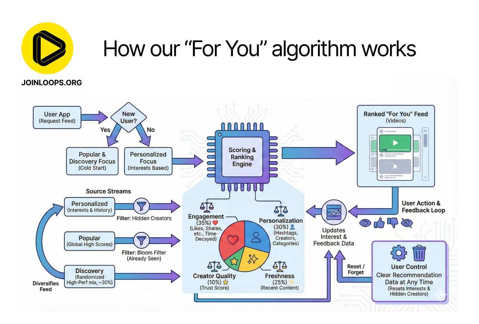
So let’s see what this suggested algorithm is.
-
It starts out with “user requests the feed”, and depending on whether or not you have “preference” data (prior interests or choices, etc), you give either a selection based on something generic, or something that you can base recommendations on. Well… sure. So far, silly, and trivial.
-
“Scoring and ranking engine”. And below this, a pie diagram with four categories. Why are there lines between only the two top categories, and the engine box? Seems weird, but, OK. I suppose all four are equally connected, which would be clearer without the lines. Also, what are the ratios here? Weights for importance, of some sort? “Time-Decayed”? I hope that’s not the term that stuck for measuring retention/attention time.
-
On the three horizontal “Source Streams” arrows coming in from the left, its all just weird. The source streams are going to be… generated content, no? But let’s give it the befit of the doubt and assume it’s suggesting that, given generated content, some of it might can be considered relevant for “personal preference” and has a “filter: hidden creators”, but, none of that makes any sense. The scoring and ranking engine is already suggested to do this part… The next one is “Popular (high scores) filter: bloom filter (already seen)”. Which mixes concepts. A bloom filter is the perfect thing to confuse an LLM, because it has nothing to do with filters in the exact same context “filters” was used for the above source stream. Something intelligent wouldn’t make this mistake. But, it does statistically parrot it’s way to suggest that a bloom filter might have something to do with a cost effective predicate function that could make sense for a “has seen before”. However, why is this here?
I’ll just leave it at that. This infographic would make a lot of sense if it was created by some high schoolers who were tasked to do something like this. Came up with some relevant sounding concepts. Didn’t fully understand any of them. Which is also exactly the kind of stuff LLMs do
I don’t think loops hired a bunch of kids, so LLM it is.
And the like “Our new For You algorithm is pretty complex, so we created this infographic to make it easier to understand!”, doesn’t help the case against LLM either. There a many complex parts of a recommendation engine, but none of the things in this infographic explain or illuminate those complex parts…
But, I might be wrong, and this is their earnest attempt at explaining how their algorithm works. In which case, they are just bad at either explaining it, or at designing it, most likely both. Then again, if I’m right, and this is generated by an LLM still gives the same impression, but leaves some room for “someone who isn’t technical, asked an LLM, and phoned this in because it looked cool, and people who don’t know any better will think so too!”
Ty for the effort post. It’s all french to me so I was looking for arrows to nowhere, crooked lines, and messed up text.
Happy to hear. Cheers
-
Loops kind of sucks.
No u
I mean, tell me I’m wrong. Tell me that there is good content. Tell me it functions well.
It’s still in early stages. Give it time :)
It’s literally in its infant stages. You think any of the major social media sites just started out with a bajillion accounts and a neverending feed? I remember signing up for Facebook and Instagram in the very early days. It looked like the fediverse.