
As a strong supporter of open-source and community-funded projects like Lemmy, which prioritize serving users over investors, I believe Lemmy has significant potential, and that’s why I am here. However, it is clear that its growth is nearing a plateau in its current form. Despite the surge in users following Reddit’s API changes, Lemmy continues to primarily attract tech-savvy individuals, politically left-aligned users, and those accustomed to old Reddit. For Lemmy to reach the broader average general audience, meaningful changes are necessary.
The rise of Bluesky demonstrates the importance of ease of use and a user-friendly design. Its polished and familiar interface is a key reason for its growth and appeal as an alternative to platforms like X/Twitter. This same ease of use is what Mastodon lacked, leading to its initial hype fading quickly. The average user is unlikely to adapt to something that feels complicated or unfamiliar, and this challenge also applies to Lemmy.
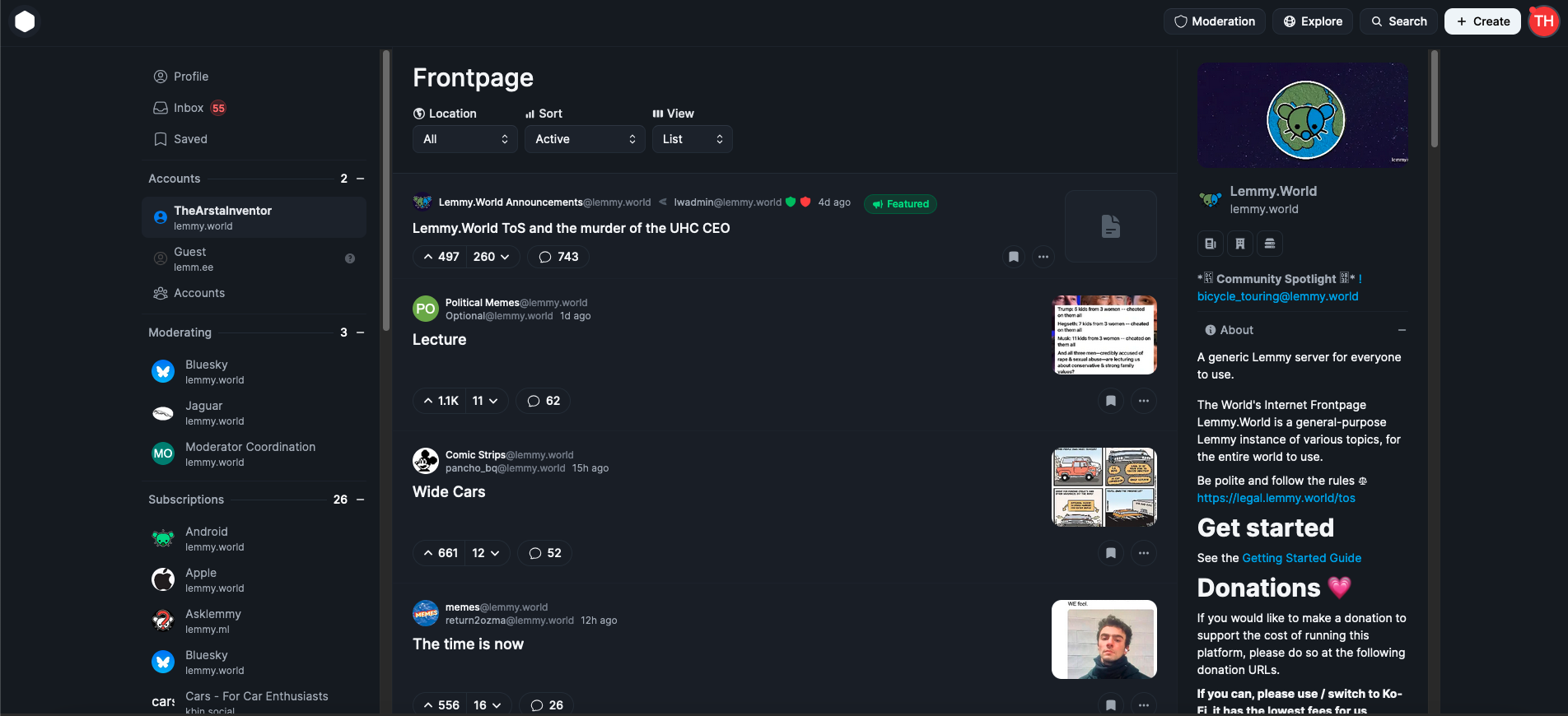
As someone who started as an average Reddit user and became more tech-savvy over time, I can confidently say that first impressions matter. When users first visit lemmy.world, the default UI is often enough to discourage them from staying. Most will not explore the homepage sidebar to explore, figure out and switch to one of the alternative UIs available, which is unfortunate because a better UI could make a huge difference.
This is why I propose that large servers like lemmy.world adopt Photon UI as the default web interface. Photon is currently the best and most mature alternative UI, offering a visually appealing, modular design that feels familiar to users of new Reddit. It makes excellent use of screen space and provides customization options like compact and cozy views. Unlike some other alternative UIs, Photon is actively maintained and ready for widespread use, although in no way is it perfect, this can also help bring in more contributors to the project development.
While it is important to continue offering other UIs as options, I believe adopting Photon as the default UI could make Lemmy far more appealing to the average Reddit user. First impressions are crucial, and the current default UI has turned off many potential users. If we want Lemmy to succeed as a true Reddit alternative, we need to prioritize user experience and accessibility. Thankfully today, Lemmy still continues to be THE biggest Reddit alternative, while our userbase is still considerably smaller than Reddit, it’s the biggest of any alternatives, and Lemmy continues to somewhat be in the spotlight for those seeking alternatives, we can’t let growth stagnate, it’s high time we make the platform more welcoming and appealing for the average joe.
EDIT: The image I attached is from photon.lemmy.world, which I just realized is using the outdated version of Photon, I have updated the image to the updated current photon version from phtn.app. There are a lot of improvements made.
I love the Lemmy UI.
But I’m a gen Xer.
There’s some great analysis floating around of how different generations actually interpret UIs (and make decisions about how or whether to engage with them) very differently. So there is no “one size fits all” that will make everybody happy. Change the Lemmy UI to something like Photon and I’d be like… “this is dumb.” Making a bunch of very different options is a lot of work. If you want to do it… no one is stopping you. The Lemmy project is opensource and you could go start contributing and making pull requests today. You could go run your own instance and make it look like whatever you want and get the average redditors to join that. I run my own instance. We have a whole two users. It works exactly the way I want it to and federates with exactly who I want it to.
Frankly, I’m not sure Lemmy needs to go out of it’s way to appeal to the average redditor in order to have a thriving, healthy community. Sure, there are some things I miss about having a giant user base to engage with, but honestly, I’ll trade them for the MUCH MUCH lower toxicity. I don’t know that “growing Lemmy” should be our focus. It’s not like we’re getting paid.
This is a good take.
Speaking from the same neutral pragmatism, it makes sense to let the default Lemmy web UI be a lightweight, actually-mobile-friendly derivative of old.reddit, rather than a more committed default like Alexandrite or Photon.
Keeping things similar is a good jumping-off point, and if we do want to make some large change, different generations and cultures have heavily varying default preferences. Wouldn’t it be wiser to pick a common ground, something these differing peoples have grown used to, as opposed to some new style A or B or C likes?
(Fun fact: if you think that ppl sticking to old designs is silly, Panasonic has a whole $$ niche in Japan selling modern-internal, vintage-external laptops with DVD drives and old-style keyboards. https://old.reddit.com/r/thinkpad/v0t06p literally has both a VGA and a thunderbolt lol)
Fun fact: if you think that ppl sticking to old designs is silly, Panasonic has a whole $$ niche in Japan selling modern-internal, vintage-external laptops with DVD drives and old-style keyboards. https://old.reddit.com/r/thinkpad/v0t06p literally has both a VGA and a thunderbolt lol
Just in Japan?? I’ll buy one of these right now!
I love the Lemmy UI.
But I’m a gen Xer.
So what?
I’m sure you know that the value of a user or an opinion has nothing to do with their age.
Why be ageist to yourself?
I think you badly misunderstood my take.
I think you badly misunderstood my take.
Nah I just responded to a minor part (which I might have misunderstood). Sorry … 😈 🤣 .
I actually agree with everything in your post.
You really trying to convince us with a screenshot of the ugliest ui i ever seen huh
Yeah I used old Reddit. I don’t want something that looks like new Reddit
You both aren’t wrong… But this isn’t about you.
If it’s not about me then why does it exist.
.world in a nutshell
better than whatever the fuck .ml in a nutshell is.
I absolutely hate it so much
deleted by creator
BTW I actually used an outdated version of Photon on the screenshot, looks like lemmy.world haven’t updated their photon version, I have updated the post with the updated current Photon UI, I think more people will like it. It’s an improvement from the older version.
Hi everyone, I’m the dev. Reading all these comments really hurts when it’s something you’ve poured your heart and soul into for over a year.
There’s reasons I do everything I do in this UI, and my primary goal is to make Lemmy accessible for everyone.
This is the “cozy” view as well, but there’s a “compact” view for people like me who enjoy more information density. Again, my end goal is to make Lemmy accessible. I don’t do this for the sidebars for convoluted reasons I won’t get into.
I’m not the one trying to advertise it, and I’ve never really tried to because of the fear of disapproval. I think I should advertise it myself now because then I can showcase the best parts and not get misunderstood. This screenshot uses the “list” view, imo the worst one, with some cursed chrome scrollbars.
Now that I see that the majority of users believe this sucks, I’m not sure if my mission is worth it or if I’m even doing it right.
I’m probably being too sensitive to criticism which I should expect from any project. But this project is the only one I used to feel proud of, then people chiming in claiming it’s the ugliest thing they’ve seen. I don’t know im blind to design which is the only thing I considered myself “good” at in terms of web dev.
Dude UI (and anything to do with looks) is always a subjective thing. Some people will like it and some people will hate it. I know every dev wants their UI to be loved by everyone but that’s a fools errand as there are always people with opposing opinions. What matters is that
thatyou like what you have created. Also know that there are people like me and many others who use photon daily and love the design. Don’t let subjective opinions get you down.Don’t take it that way. I find the default UI horrible and primarily use Lemmy on Voyager on my phone because of it. Finding this thread let me find that I can comfortably use Lemmy on desktop too! 🥳
I didn’t join Lemmy for a while because I liked the “new” reddit UI better and found Lemmy too different to use easily. I tried all the different options and I didn’t like them. THIS IS EXACTLY WHAT I WANTED ON DESKTOP!
And remember survivorship bias. The ones that can put up with the Lemmy UI, or switch to something they like better, are (for the most part) the only ones here now giving feedback.
Never used your project but don’t let this thread get you down.
Clearly OP loves it - don’t let those who don’t know it or don’t like it be the voices that ring loudest in your ears even if they hurt the most.
I worked professionally in open source at a company with lots of funding. The tools I worked on were used by millions and millions.
Every negative comment hurt so much. Every angry user I wanted to talk to. Most of them wanted to TALK AT me. It all hurt. And I was being paid. The engineers on my teams were burnt by the community time and time again.
If you love what you’re doing and you have a growing or happy audience - stay the course. Listen to criticism, decide if you agree (and maybe take some time when it hurts because the criticism might be valid), make a decision and move on.
Also, and this is going to be tough, maybe think about expanding or modifying what you mean when you say making Lemmy accessible for everyone.
Do you mean making a UI that will become the majority default or making a UI that brings some features (or perspective) for users who see value in those features? Trying to make something for everyone in a pond as small as the fediverse, where there are already a plethora of options is a big lift.
Above all, do you. And that includes this comment which I encourage you to promptly ignore. ;)
I haven’t met a single person that didn’t like Photon. Photon is the only reason I started browsing on desktop regularly. It’s lean, clean, and packed with gorgeous transitions; I’ve rarely ever found a project that gets form and function right.
The internet is a shitty place. I’m not surprised that on Lemmy we have shit like
- “client with no JS when?”
- “I don’t want normies anyway”
- “I’m too old to appreciate a modern-looking UI”
- “eww I don’t like this thing that carries subjective opinions, let’s never let anyone use this.”
The troll energy is strong, but it doesn’t change that this is a great project. Alternative UI’s are what make Lemmy unique, and you’re doing your part. That’s appreciated.
I for one am a fan of everybody doing UI Fediverse improvements. It is very literally paving the future of the internet, because the future of the internet is not corporate bullshit. The Fediverse needs to be as slick as possible, and more people working on that is sorely, sorely needed!
Don’t be disheartened. You did a great job with your version.
People complain about Apple and Google UIs that they spend hundreds of millions on creating and user-testing. There’s no one-fits-all in UI or UX.
This is a good example, look at the Magic Mouse for something coming out of a multi-trillion dollar company compared to Logitech although am sure Jony Ive had pure passionate intent in his heart.
Yeah Lemmy has an unfriendly community. UI is really hard and I know exactly what you mean when you say everything has a reason behind it.
FWIW, Ima migrate my personal private Lemmy to photon because I think it looks great.
I assume you mean the dev of Photon UI?
An important thing to remember when it comes to feedback is that there are different audiences. The only feedback you’ll get here is from Lemmy users, the people already here, the grognards, the Linux heads who don’t understand why anyone would need a GUI at all when the terminal is right there! All to say, a bunch of wads who would rather leave a big community for a smaller one that suits their preferences. They don’t know jack all about jack shit when it comes to designing for a general audience.
All to say, if what you want to design is accessibility… solicit feedback from people who need and understand accessibility features. I have no idea where those people are but I bet you’re savvy enough to find them.
If you can design something that looks like OP’s screenshot (and better, based on your comment), you straight up need not concern yourself with the negative feedback on this thread. Bunch of wankers. Continue being awesome and making awesome stuff!
Photon is amazing, and I use it daily. I love it. I’m sorry about the users in the comments that don’t understand what “subjective” means.
Thank you for all your work, and keep doing what you’re doing!
don’t worry, you’re doing fine
Hey man you and the team did a great job. Love the default UI. It’s all open source yeah? So they can change what they want. Kinda like what semaphore social did with mastodon.
deleted by creator
Nah, the current UI is fine. We don’t need fancy shit on a link aggregator. Reddit went to shit after “updating” the UI.
Your opinions of “good” or “best” aren’t the same for everyone.
Different OG ex-redditor here. I think Lemmy’s UI is vastly superior. But full disclosure, I used old reddit.
How is it clear that Lemmy’s growth is nearing a plateau? And why does Lemmy need broader growth? That seems like a solution in search of a problem. A major advantage of not being a corporate social media property is not having to think like one.
As much as i love photon, i don’t think it should be the default. The default lemmy ui is pretty slick and lightweight, even if it is kind of bad. Photon can be sluggish, and overwhelming for some.
I think they should just improve the default UI (which they are currently), and leave it for the user to decide.
People who prefer old Reddit often say the same thing about new Reddit. While old Reddit, or in this case a barebones, simpler UI, is lightweight and “slick,” the reality is that if we want Lemmy to grow beyond its current base of tech-savvy users, we need to consider a different perspective, one that focuses on the needs and expectations of the average user.
For example, despite old Reddit being lighter and having its loyal supporters, 80 to 90 percent of users still prefer new Reddit. As someone who used to moderate on Reddit, I can confirm that the majority of traffic came from new Reddit, even though old Reddit was still available. This highlights how a more modern and user-friendly interface is often what appeals to the majority.
From my personal experience as someone who primarily used new Reddit, Photon feels far more intuitive and familiar compared to the default Lemmy UI. That said, I am not claiming Photon is perfect. However, considering that most alternative UIs are currently niche and their development relies heavily on a small group of contributors, Photon stands out as a mature and robust option.
While it is encouraging to see Lemmy’s developers working on improving the default UI, the project is still in its early stages and may or may not succeed. Why start from scratch or bet on something that is just beginning development when we already have a well-developed alternative like Photon? By adopting Photon as the default, we can take advantage of an existing solution that is in good shape, has significant potential, and can continue to improve with more widespread adoption and contributions.
This approach would ensure that Lemmy becomes more accessible and appealing to the average user, while still leaving room for users to choose other UIs if they prefer. First impressions matter, and adopting a polished and familiar UI could make all the difference in attracting and retaining new users.
BTW those who want to can still change to alternative UIs, nothing will stop them from doing so.
Not sure where you’re getting that 80 to 90 percent figure, but most users being on new reddit is not at all a reflection of preference, it’s of new being the default option
deleted by creator
I also prefer the new (new-old, the current one sucks) reddit UI and love photon, and i don’t think it’s too far fetched of an idea to want it as the default UI. I think it should be left to instances, so for example, lemmy.world could use photon for the default, yet lemmy.ml could use the default lemmy UI.
I’m still a little concerned over first impressions of a new lemmy user, when they try to use lemmy.world on a weak device, and realize it is slow, or laggy, and could sour their opinion on lemmy as a whole. A non tech savvy user might not completely understand the idea of lemmy, or clients, or even instances. They’d just blindly choose lemmy.world and assume that’s the “main” instance. (I also could just be underestimating the average user’s intelligence, lol.)
That’s why i brought up performance as a main point to why we should keep the current lemmy UI. Maybe if photon is optimized and is more stable, i could completely agree that it should be the default.
I just use the Voyager app, which has a great UI, with no need to visit the website at all.
I should mention this is mainly for desktop users :), but even for mobile users, people usually check the website first before downloading apps.
Voyager also has a web version web version
Voyager FTW, imo
Eww. I don’t like that screenshot at all. I vastly prefer the more info dense version I use that looks like classic reddit.
I mistakenly used the old photon version, I have updated the post with the image of the new current updated version of Photon.
You can customize photon’s post layout to make it more info dense, even more than the newer image I have attached on the post.
While that is preferable to the previous one, it’s still only showing 3 posts with tons of wasted space. This is putting an infosparse UI over an infodense application/platform and when you do that you lose functionality and make using the platform more tedious and time consuming. In a way it’s nice but it loses too much function to be appealing in this application. I could see that being an acceptable UI for another platform but not a link aggregator where the whole reason for existing is to gather a lot of information together.
Lemmy will be getting a new, more modern UI sometime soon.
It is being actively developed and you can even try it out today: https://github.com/LemmyNet/lemmy-ui-leptos
I know I’m tech-savvy, but I actually enjoy the fact that Lemmy (and the Fediverse) doesn’t hand everything to me easily on a plate. The hunt for new interesting communities, my long well curated block list, setting up Lemmy apps exactly to my preferences is part of the fun.
If someone handed me a fully configured Voyager app on day one, I wouldn’t have had all the exciting experiences trying a bunch of apps to find the best one for me, learning how to block instances and communities, learning how to correctly link to communities and users, finding new ways to discover communities.
All this stuff is part of why I come back here everyday. A ready out-of-the-box solution is kinda boring.
A lot of the comments including yours sound gatekeep-y to me but I have to say I kind of feel the same way.
Everyone who has come here and stuck around found their way through the jank and is joining an exclusive club of high-quality discussion. Like Linux, once you can get past the basics, you can customize your experience nearly limitlessly, but it takes effort, trial and error to get to something you like.
I’m not at all tech savvy[1], but it’s not that hard, honestly.
[1] context: I know that when a steam game doesn’t work, sometimes I need to reinstall a driver, but I never remember how or where to do that. I use an iPhone from 2016, and I unlock it with my fingerprint.
I don’t see any issue with the current UI.
That’s too much padding. It needs to be more like Hacker News.
I think we need to actually do some new user testing, instead of endless discussion with nothing to back it up.
I basically only use mobile apps, so I don’t even remember what the desktop UI looks like. But if you say so!
Yup. Voyager/Wefwef is basically the new Apollo. It’s not 100% there in terms of feature parity, but it’s damned close and is being actively developed.
I’m fine with having less normies and an non-algorithmichal echo chamber of fellow leftists and tech savvy persons. These are my homies.


