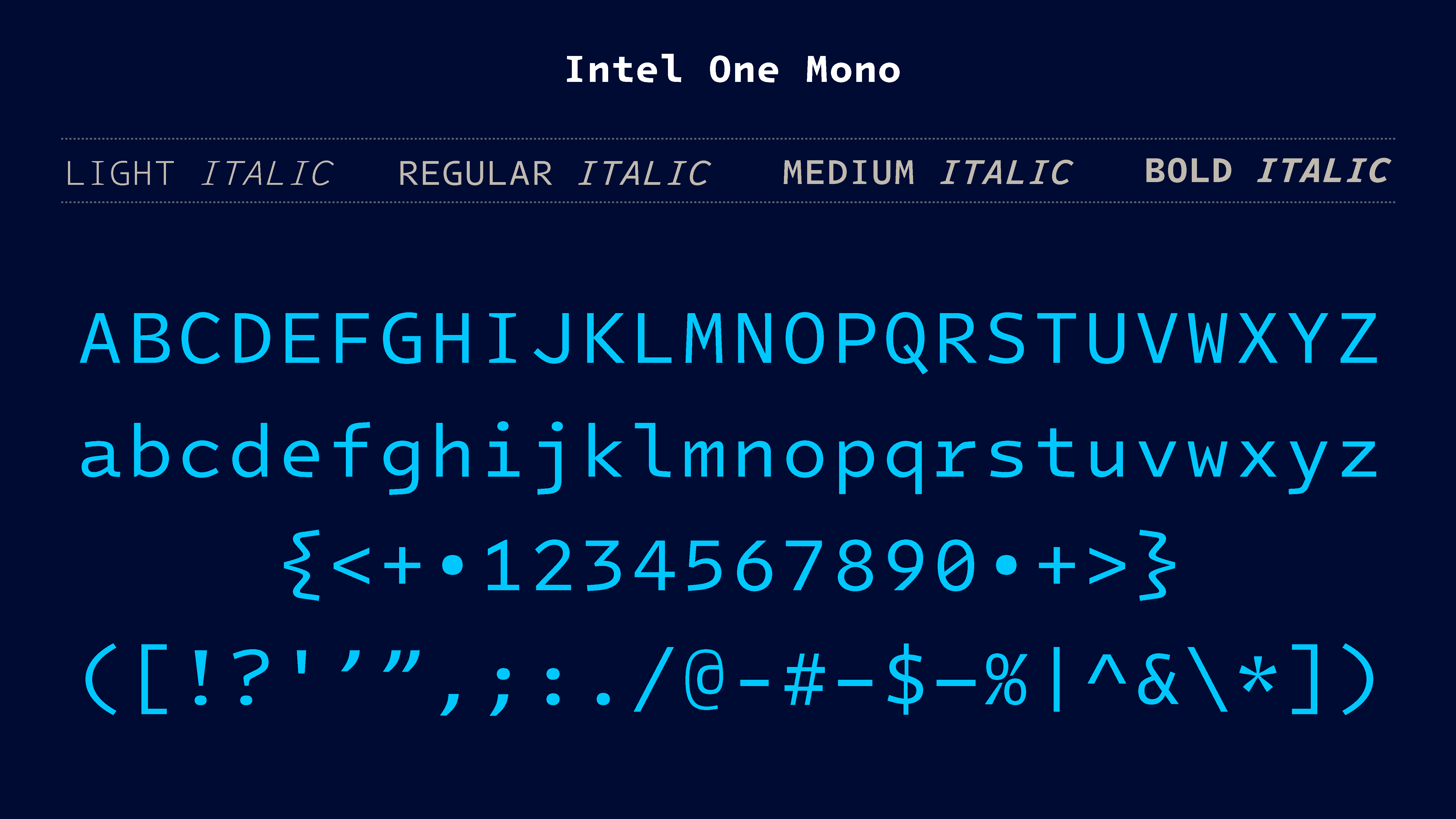
Designed to be easier to read and parse
You’ll have to pry Comic Code from my cold dead hands!
My poor eyes 😂
I’ve been using this for two days now on high contrast mode in Jetbrains IDEs I love it!!
Edit: wait I lied, I’m using Comic Mono, same idea though
I have Comic Mono too, it’s great. I’m using Comic Code for ligature support.
Ooo might have to check that out
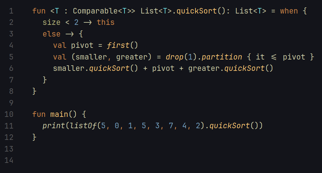
I like the curly braces (much easier to spot the difference from some other fonts that lack a well defined point).
But I’m still a fan of fira code for generally well done ligatures.
Edit: fira code, not sans.
I’d like to see a font like this eventually replace the Ubuntu system typeface. There’s a lot of nostalgia and charm in that font, but it’s godawful ugly T_T
Something about just looks a little off.
It looks alright. I might give it a try. I tested out a bunch of different mono fonts recently and landed on Fira Code. I’m still getting used to ligatures but so far I’m liking it more than I expected.
Love Fira Code with ligatures
Looks pretty good. I don’t think anything will end up shaking me loose from hasklig, but more choice is pretty much never a bad thing.
I don’t like the braces :( Meslo LG M shall remain my daily driver
Looks too squished for me, I currently use roboto mono
I’ve been using Hack as my font of choice since probably around 2016 I think. I did a close comparison between the 2 after downloading it, and wow! I think this Intel font might finally replace Hack as my programming font of choice. The font does a great job of making all the common character look distinct from each other. I especially notice the parens and braces having some nice detail. I’ll have to try it out on actual files, but it looks good so far!
Personally, I still prefer PragmataPro (tho I do admit it is a very expensive font), but this does look pretty good
For my taste it looked a little too wide. Not as good as JetBrains Mono.
+1 for JetBrains mono. Been using it for years now.
I personally like the Jetbrains Mono font
I still find Fira Code and Meslo to be better. Nothing beats these 2 fonts.
I tried it at work for a few weeks but in the end I went back to Iosevka. Not sure if it’s something with the Intel font, being used to Iosevka, some combination of those, or something completely unrelated, but it’s the only font I can use comfortably on daily basis, after migrating from Operator