
I personally hate rounded corners and shadows added everywhere. Makes most things look crappy and smudged.
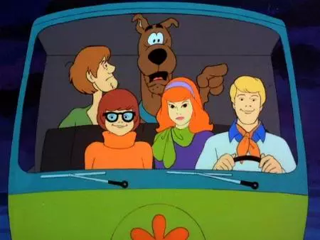
Touch screens in cars.
When I’m driving I need a tactile immediate response that is easy to understand without looking at it.
Touch screens are for controls that change so you can take advantage of the dynamic nature of a screen for the static needs of a car and the immediate feedback you need, make them the worst possible solution.
Oh wow, I hate it so much. Look down at the screen, aim for a button or piece of UI, look back at the road because you have traveled about 100m without checking what in front of you, or coming at you from the side, keep your finger on the same trajectory towards the desired UI then BUMP, you hit a slight depression in the road and FUUUUUUUUUUUKKKKKK you just switched off your favourite podcast and switched on the FM radio you never use so it’s never tuned and it in so it goes BRRRRSHHHSHHSTTTSHHEEEEXXXHS. Then it takes about 4 or 5 steps to get back your podcast, each of which can turn out to be exactly the same as the one which switched on the FM radio.
Touch screen in cars. Whomever it was that signed off on that development, may you suffer a long and painful death.
I like my car because it has buttons for all of the important things I’d need to adjust while driving, and the rest is on the touch screens. I would lose my mind if temperature controls were only on the screen.
More like a meta trend but the whole “let us redesign the look of everything for no reason every couple of years” thing gets old quickly.
As for actual trends, the one where they put all the options into one menu even though there is plenty of room to have individual buttons.
This is almost always because of some chump who wants to move up the corporate ladder and desperately needs something they can point at and say “Me, I did that.” When it comes to applications, that’s a lot harder to point at when what you did was fix some obscure bug that most people don’t deal with.
No, this is middle management fuckwits who have nothing better to do angling for a way to get a better position.
The fact that this happens at Google just shows how they’re no different than any other giant shitty corporation, because they’ve got idiots manning the controls who are more interested in moving up than doing a fucking good job.
Source: My sisters ex-husband who is a dipshit who works at Google and did exactly this while chasing a promotion.
I mean, assuming your employer’s corporate structure encourages this very thing (as does Google’s), and you want career progression (as having career progression at Google is presumably great for your resume), what else can one do?
Not saying he wasn’t a dipshit, just that this is just how it works in corporate land. Yet another reason I tend to avoid working at one of these places lol
Disappearing scroll bars.
Disappearing thin translucent scroll bars. It’s so inconvenient.
Disappearing anything. I suppose it is more of an app thing but greying out at least indicated there is an option available under some condition.
When marking something to copy and paste. You start marking the text and drag to the right. If you drag too far to the right, your highlighting goes away and everything to the left of where you started becomes highlighted. Why would anybody ever want that behaviour? It is exactly the opposite of what you are trying to do.
Oh yeah. Or trying to highlight something including text further down, you want to scroll it a little bit and suddenly it accelerates and you highlighted the wohle page.
This is one of those things that came out of the gate sucking massively and nothing was ever done to improve it. We might be in our 60s some day still fumbling around trying to copy some text.
A variation of this that drives me nuts at work
Trying to highlight part of a url it decides nope you getvall or nothing.
On mobile when you do finally highlight from the right part, but then it scrolls at either 18 pixels per minute or 1000 characters a second.
Who the hell designed that, URLs are structured, you only ever want to copy between the slashes and url parameters.
This is less a design choice and more the reality of package-based architecture, but - menus that I have to wait before interacting.
I spent most of my life being able to enter clicks and hotkeys as fast as I want, because they would queue up and the app would resolve them in order. Now I can’t type too fast after pressing the Windows Start button, because the start menu needs time to load before it can handle KEYPRESSES. Tapping Windows key followed by “Discord” will search for “iscord” or something if I type full speed.
It feels like every modern app is optimized for a slow person browsing one-handed on a phone.
They assume all windows users only have one hand free at all times
there is an even worse case for that. CTRL + F in a browser and directly start typing while you’re in a webpage/webapp with hotkeys shortcuts. I end up marking posts/emails as spam, deleting them from my view, start replying or whatever action they’ve assigned in a single key press.
Jup. And then you have to catch yourself before selecting because the content you are seeing are about to be switched with web results in a second…
And then, as you wait for the program to load, because you are already on a roll you switch to another window and continue working. But the program that is loading and updating and showing fancy launch animations keep stealing the focus over and over instead of staying in the background at least until its done.
Being effective in Windows is difficult.
It’s so MADDENING
Thin scrollbars. Why do I have to aim for a tiny area to click on a scroll bar? Other UI elements aren’t that narrow.
This enrages me.
When did the scroll bar area become so damn small? I still like to use it to move around a page. At 1440p it’s so tiny. I can’t imagine at 4k. Am I just old now?
I can’t remember the last time I had to click on a scrollbar.
Sometimes scroll wheels break and you don’t have money for a new mouse.
Fast scrolling when pageup/pagedown is not available or not enough
Long press the middle mouse button and use the drag scroller.
This is bad UX:
- It’s disabled by default
- It has a different function (open link in new tab)
- It can be intercepted and disabled by the webpage
- Not as intuitive as a scrollbar
When pageup/down is not available you usually don’t have a mouse either. Think of a laptop with a minimalist keyboard or a phone.
I rarely do, but they are very handy for quickly scanning a long document (drag the scroll bar until I see a header, stop, read the header, and keep going).
I use the middle mouse button scroll for that.
The removal of borders on buttons. I don’t know how many times I’ve been using a piece of software and haven’t realized for a long while that some icon is actually a clickable thing and not just some UI decoration or something.
The removal of text in favor of icons. I hate having to memorize what all your icons mean in your app. Please just make text unless it’s something insanely obvious. It’s even worse when they neglect to put tool tips to tell you what the icon is supposed to mean
I teach IT for seniors (basically a class room full of your Nan asking how her phone works) and I 100% agree with both of your points.
For experienced users, a lack of distinct buttons, and the use of icons only has the potential to slow you down.
For new users, learners, and people with cognitive or visual impairment these features make websites and apps boarderline In-usable.
It’s very hard to teach people how to use a computer when I must first teach them an endless codex of icons and symbols, and train them to mouse over anything and everything in case it’s a button.
Like wise, companies like Google need to stop being cute with confirmation buttons that say “got it” or “I’m in”. Stick to basics like “okay” and “agree”, because a lot of IT students in community education are non-English speaking, so indirect buttons like this are even more confusing. And for those of us who are fluent in English, we’re often scanning a page for specific text, and we’re even less likely to recognise a button is a button if the text on it is something that has never traditionally been put on a button.
This exactly is what I hate most about eclipse. I do something and suddenly there’s an icon on every single file of my project, and everything stops working. Now instead of googling an error I have to search “eclipse orange star icon”. Worst of all is that they reuse icons for different errors. I absolutely hate it.
The trend to make an ad link suddenly appear right where and when the user is likely to press.
I’m surprised advertisers don’t have much of a problem with it. Because it just makes me fucking despise whatever website I was tricked into going to.
It would be like a sandwich shop hiring a guy to wear a sandwich costume and pass out flyers on their corner. Only, instead of just doing that, he forces you into the sandwich shop. Guaranteed I would be pissed and hate that place for life.
And shucks, looks like the little x moved right when tried to click it to dismiss the ad and now you’re on a shady website.
Dark UI patterns being socially acceptable. If someone advocated for or implemented a greyscale cancel button next to a vibrant and bold accept button then they should be tarred, feathered and disowned by their family.
The left side gutter that, I fear, is a trend still in it’s infancy.
Dear Microsoft: I’m never going to launch apps from within teams or outlook. Why they fuck would I, that’s what your terrible OS is for. Stop it.
Don’t forget Microsoft’s whole “we’re gonna pretend like we’re integrating everything just so you can never find anything”… I work from home half the week but don’t want to receive phone calls after-hours (because of course we had to fucking get rid of real phones and change to Teams). Oh they claim there’s lots of scheduling options, but when you dig into it you find out you can’t actually schedule anything in Teams, you have to go into Outlook. I’m on Linux, Outlook isn’t an option even if I wanted to touch that steaming pile. So I go to the web version of Outlook only to find that no, despite their assurances, you cannot actually schedule your office hours to send phone calls straight to voicemail. That feature might come “soon” but considering half the time our staff launches Teams they get a blank page on private chats and have to keep restarting until they show up, I have a serious lack of faith that Microsoft could code up something useful for office hours.
tl;dr: Using “integration” as a buzzword to put options in unrelated and unused products, only to discover those features don’t even work.
Does non-pausable videos count? I can’t understand why apps like instagram, which exists to show pictures and videos, has the worst picture and video handling of all time. Can only magnify pictures by pinching and it only works while you’re still touching the screen. Can’t pause or restart a video. Want to show someone a video? You have to scroll to another post and then back to the video so it starts again.
I like the idea of instagram but the actual reality of it is utter, utter dogshitYea I don’t get it either. Also no volume control ?
Like, fuck you
Those carousels on Netflix/Prime TV apps displaying the trailer if you stay 1sc on an item. So annoying, forced to keep moving back and forth to watch the movie image
Yes, and not just that … like, making sure to keep the cursor away from the images all the time because hovering over an image immediately plays some trailer including audio.
Generally, playing media elements without explicit triggers by the user is annoying, but this is the worst.
Like, who thought this was a good idea?
Thank you. Your comment/advice has completely validated my switch over to Lemmy.
This is more UX than UI but the inconsistent volume is a nightmare, adding insult to injury. Everything I want to be equal or quieter is way louder.
I don’t know who is responsible for horizontal scrolling UIs to begin with, but I hate them. Carousels work on mobile where there is touch, and absolutely gargle balls on desktop.
“Mobile first” wich results in overly large buttons and font sizes and empty space on desktop.
That’s not mobile first, it’s mobile only. Pretty much half of my web design course was the professor ranting about designs that don’t adapt to the device they are being viewed on, and how to do that right.
Anything overlaid on top of content, especially those chatbot bubbles.
Also, “No, thanks”/“Remind me later” options on popups where they should be “Fuck off and don’t show this ever again”.
Talking about overlays on top of content: Videoplayer overlays! Pops up every time the mouse move a pixel, darken the entire screen for some stupid reason, sometimes with some text or a huge play/pause icon, and sometimes just refuse to disappear until you’ve focused and unfocused the window again or done some other mystical ritual.
That shit where something on the page loads a few seconds later than everything else and shifts whatever I’m trying to click on down
… And you end up accidently clicking a button that was previously above, and landing on a page you didn’t even want to see!
move mouse to click “cancel”
page shifts.
accidentally click “i agree to the terms and conditions” checkbox
in mild panic try to click the checkbox again.
cookie permissions banner appears.
accidentally click “agree to accept all cookies”
heart rate and breathing increase. panic sets in. pupils constrict. sweat forms on brow.
slowly move mouse to the “cancel” button.
wait 60 seconds while hovering mouse over the button.
take a deep breath, clench all muscles.
click “cancel” button.
page shifts.
“congratulations on signing up for your new credit card!”
start screaming “no!” repeatedly.
popup appears: “as a bonus, you’ve been subscribed to our premium services.”
start crying.
“your new credit card will automatically be billed weekly for this service.”
beg audibly at computer to stop.
“to cancel, simply call our 1-800 number listed below”
legal disclaimer appears below, written in 0.001 point font. zoom does nothing.
page source shows 6 billion characters on a single line.
the end.
sorry for writing in ‘greentext’ style short sentences.
If web developers took the time to specify the size of images in their code, then the browser would make room for those items ahead of time and people wouldn’t have to deal with text shifting.