
Out of curiosity, why? If it’s a knee-jerk reaction to change that’s completely understandable, but I can’t see anything to dislike about the feature itself
On top of the fact that those previews are annoying as hell as other comments pointed out, I want to add that this kind of feature also uses a fair amount of processing + memory.
I think that is a nice opt-in feature for those who wants it but I like my default light and simple.
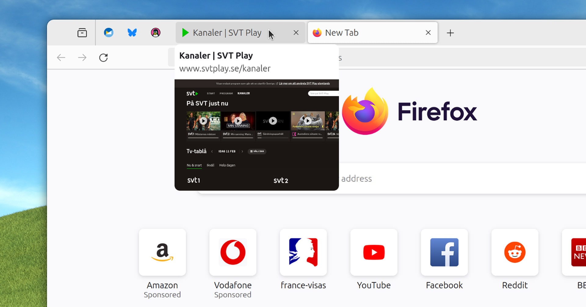
I can already read the title of the page and see the favicon, so it actually doesn’t show new information. If I accidentally move my mouse there it covers a big part of the page i’m looking at
If you have many tabs opened:
I can already read the cropped title of the page and see the multiple favicon
When I shop online, I have many tabs from the same site open. The tab title is the store name + the item name, so the item name never fits. A bunch of identical ebay icons is way worse than this.
I understand it may be useful for some people, but I’m simply not one of them
But that’s not what you wrote. You claimed that it doesn’t show new information because you can see the favicon and title. It does show new information.
deleted by creator
I think it’s more that there really isn’t a need for this. If I’m not sure what a tab is I can always click on it. Chromium got this a while back and (even with minimal exposure to Chromium) I didn’t like it, it weirdly felt annoying and unnecessary.