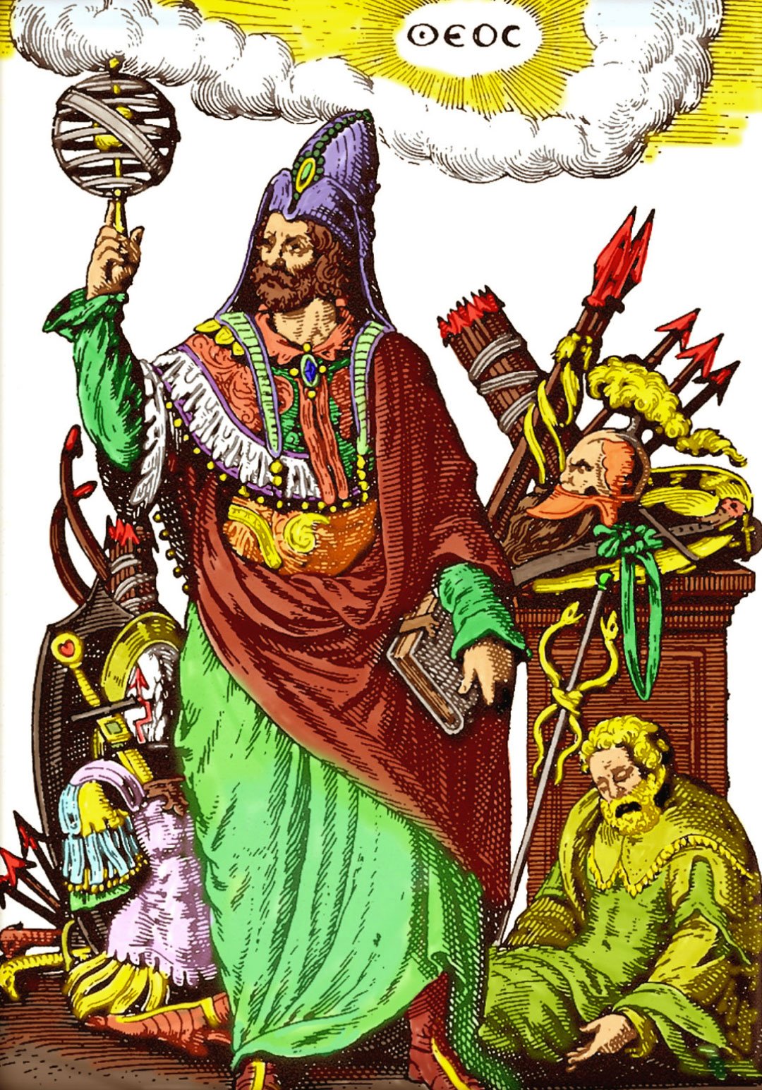

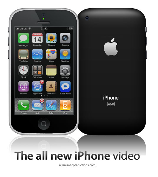
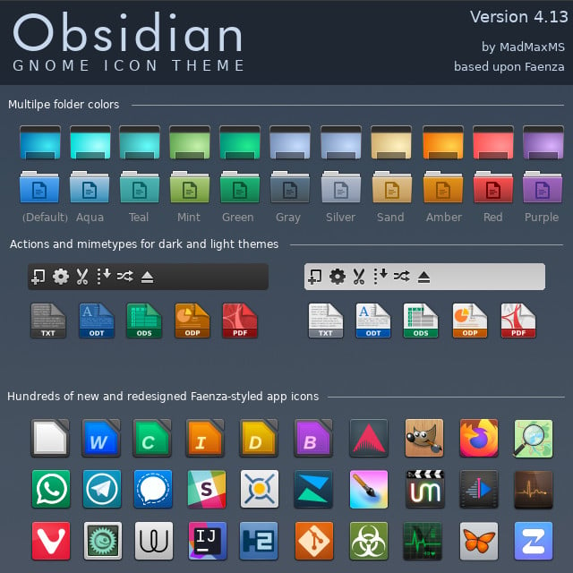
I don’t know about all of you, I don’t like these new flat icons that everyone is using. What ever happened to the old icons, like on iPhone and Samsung they used to have them years ago. Those were good times. Now it is always these stupid boring cartoonish designed icons. Side note: Somebody please update this icon pack. I am trying to use it on xfce on arch but some of the icons aren’t working properly because it hasn’t been updated in a while. I’ll donate to you right away if you do it. Link to the repo: https://github.com/madmaxms/iconpack-obsidian
Sometimes I think that I miss skeuomorphism, but then I realize it’s not the skeuomorphism that I miss, but my childhood and days when the world was much simpler.
Would I like to bring back skeuomorphic UIs? Yes.
Ya I feel you, I remember I had an iPod when I was a kid with the icons I think it was iOS 6. Now when I try to find skeuomorphic icon packs on Linux it is almost impossibile and the ones you do find are abandoned ☹️
I miss the time when not all icons were a rectangle or a circle.
It is by no means just you. I really hate how everything has to be so flat and shadow-less nowadays. I’m not at the point of shaking my fist at clouds yet or anything, but I really miss skeuomorphism in general!
Way beyond fist shaking here. My brain simply doesn’t process the trendy flat UX. It looks like when my kitchen garbage can tips over. A piece of carrot here, empty milk crate over there, sprinkled with onion peels, and some unidentified goop that I only discover later in the evening, using my bare feet, while getting a cup of water…
What’s weird though is that I similarly hate the circle android icons. They all kinda blend together like a bowl of skittles. Make them squircle though… instantly recognizable!
I am a papirus man

For those who haven’t seen snl’s papyrus skit:
https://www.youtube.com/watch?v=jVhlJNJopOQ
Or papyrus 2:
https://www.youtube.com/watch?v=Q8PdffUfoF0
A couple of the best sketches SNL has ever done
I upvoted your comment just because it had links to the reference you made.
Also, the sketches were funny; thanks for sharing them.
Thanks, glad you enjoyed them!
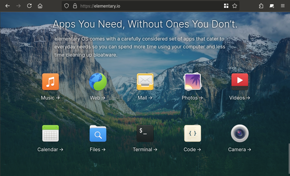
i don’t, not at all, but still think elementaryOS looks beautiful! Like holy hell, even on their websites they manage to make their design look good!

I miss UIs having lines and clear separations between elements. I loath this new flat style that everything has to have now, where you can’t tell when one thing stops and another starts.
Personally I don’t, I kinda hate old skeuomorphism 😅
Neo skeuomorphism has some neat novelty though.
Edit: this is just my personal aesthetic preference, I don’t begrudge anyone their love of skeuomorphism, or nostalgia for it.
I think I’m in the same place. I really like the idea of icons having depth. Modern icons are very versatile, but lack personality. Having some depth gives them some weight, but never really liked the emphasis on curves and gradients. I think a mix of original Material design and just a hint more depth would be the perfect sweet spot.
I’m curious how you feel about the GNOME application icons, they sound like they might be up your alley
Right now I generally have a preference for either weird stylized themed stuff I make myself, or very flat stuff like what android currently does for app icons, but I can certainly see the appeal of other stuff :)
I really like the application icons used in Gnome but I really like the consistent line weights and geometry of material symbolic icons so I’m still using a material icon pack on gnome
Edit: Here’s a picture I grabbed of icons done in the adwaita style Gnome uses in case you don’t use linux and aren’t familiar with them. Its not a full sampling, but you get the idea :)
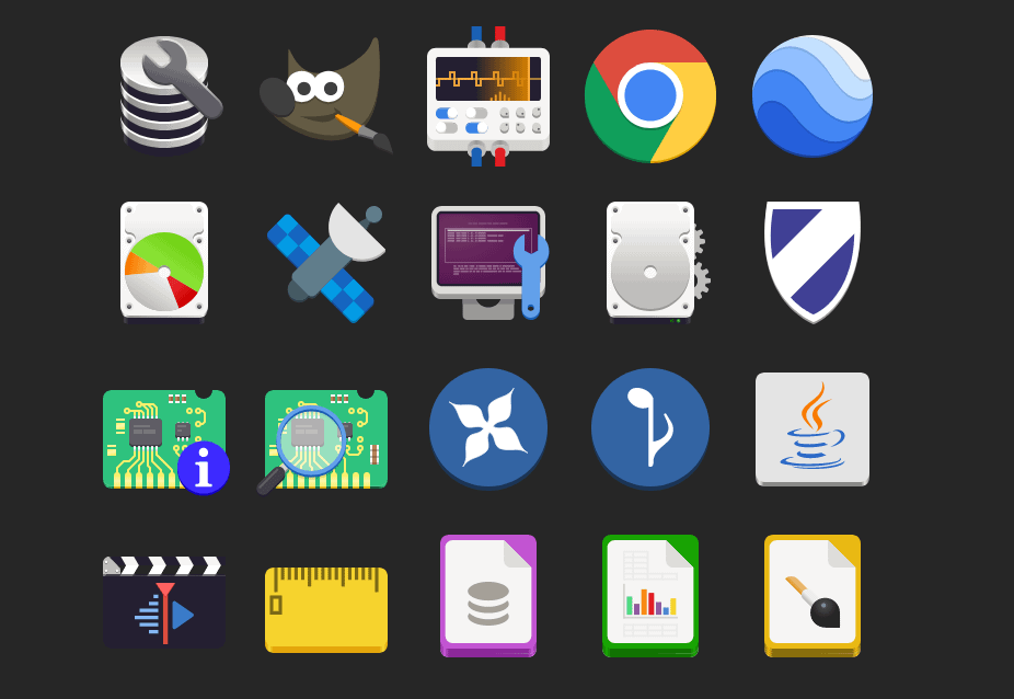
Take these icons, add one more layer of simple gradient shading: perfection
For example, GIMP’s icon looks especially bad here to me. If it had just a hint of black shading, it would look massively better (imho).
Interesting, thanks for sharing your perspective with me! ☺️
Any time! I’m a graphic nerd with none of the book learning, but I do work at a screen printing shop, so I have some intuitive understanding of logo/icon design, but don’t have the theory to go with it.
In other words, I have wildly subjective opinions that I’ll randomly dig my heels in on. (Sometimes when I have no idea what I’m talking about ha!)
Lol, I’m somewhat similar. I’m a big ui/ux nerd but don’t have professional or academic experience other than some pro-bono work in high-school. But I love tinkering with my phone’s homesceen and other similar little projects. I’m hoping to make a neocites page soon!
This is my previous phone’s homescreen I posted a while back:
https://mastodon.online/@CrisColor/111440259435482295
I’ve gotten a new phone since then and am still getting it updated to fit properly on a new screen, so right now it looks a little jank 😅 but it’s always interesting to hear how other people feel differently about aesthetics than yourself!
Right on. I’ve moved onto a dirty iPhone since, but here’s a screenshot of my super old Android setup back from when Material was new. After Android took out all the fun stuff custom ROMs could do, I sort of fell out of love with Android.
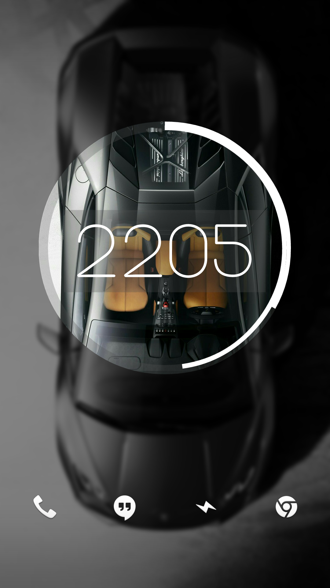
I had a cool feature at one point where it started out looking like this and unlocking it would make the circle expand and the background would show in full.
Man, I miss early KLWP
This is the first time Ive ever seen those vowels together
It’s nice and easy on the eyes. I conjecture that glossy and matte (as seen here) styles of skeuomorphism gave way to more abstract design since:
- Skeuomorphism is hard to get just right without being excessive and tacky
- Saturated, simple blocks of color pop out more, particularly on the increasingly prevalent mobile UI
- And thus also have better shelf appeal
If it were up to me, the red line would be when buttons and interactive elements are indistinguishable from text. The stock Android settings is probably among the worst offenders in this regard.
What I really miss is light mode that isn’t hated for blinding users and dark mode that doesn’t plunge the user into the void. Those “toolbars” look lovely, perfect for any lighting condition or time of day. I’ve yet to understand why, at present, designers insist on pure white everywhere when it comes to light mode. Maybe everyone is using the night light filter so it doesn’t matter? At least pure black dark mode makes sense for power efficiency on OLEDs.
Yeah, I do miss that, but idk how much of it is nostalgia and how much is an absolute aesthetic preference. I think the main reason for the change though is Microsoft trying to make Windows work well on mobile devices though, meaning forgoing the aero and more expensive VFX.
Wish some DEs would make their default style more like a win7 era style. Would be nice to have the variety.
No reason they wouldn’t work on a small phone, especially back then
Quick info, the link does not work. You need to put it in the address part aswell (like this
[https://github.com/madmaxms/iconpack-obsidian](https://github.com/madmaxms/iconpack-obsidian)Here is a working one https://github.com/madmaxms/iconpack-obsidianOkay thanks never made a post with a link
I like how tidy it is. But I do prefer to be able to see icon shapes at a glance with my terrible eyesight as it helps identify.
Colorful icons were amazing. That’s literally why the iMac sold so well. Colorful. Prove me wrong.
God, no!
Though these do look pretty, they don’t look like the buttons in Windows 95/XP and maybe that’s a good thing.
I liked the soft gradient XP icons, though maybe that’s just the nostalgia talking
What icon pack? (Is this post supposed to be a link?)
Edit: Ah. Now there’s an image.
deleted by creator


